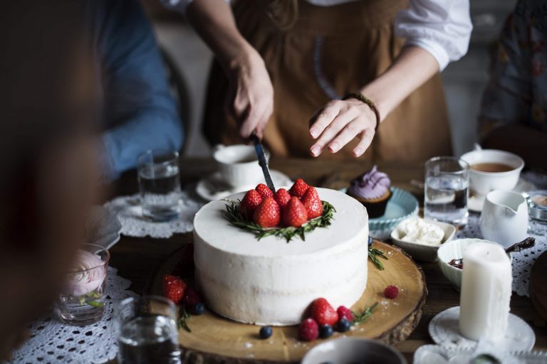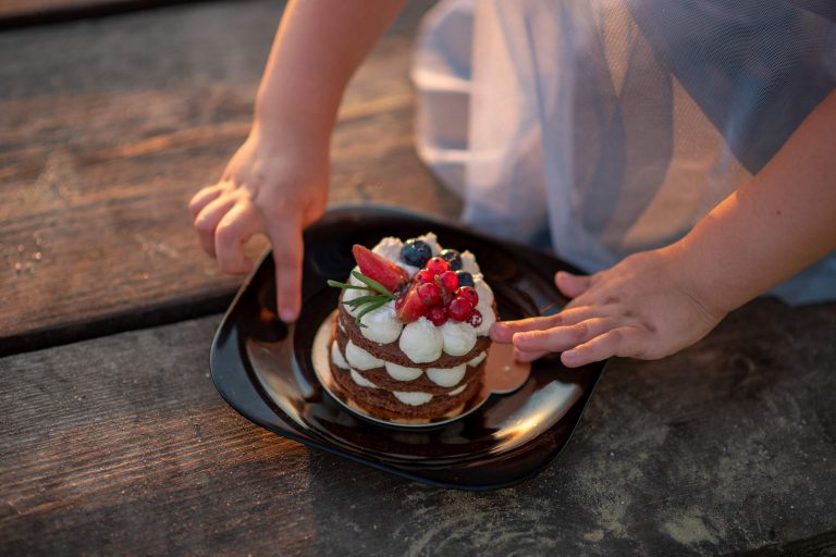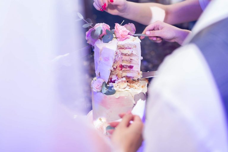
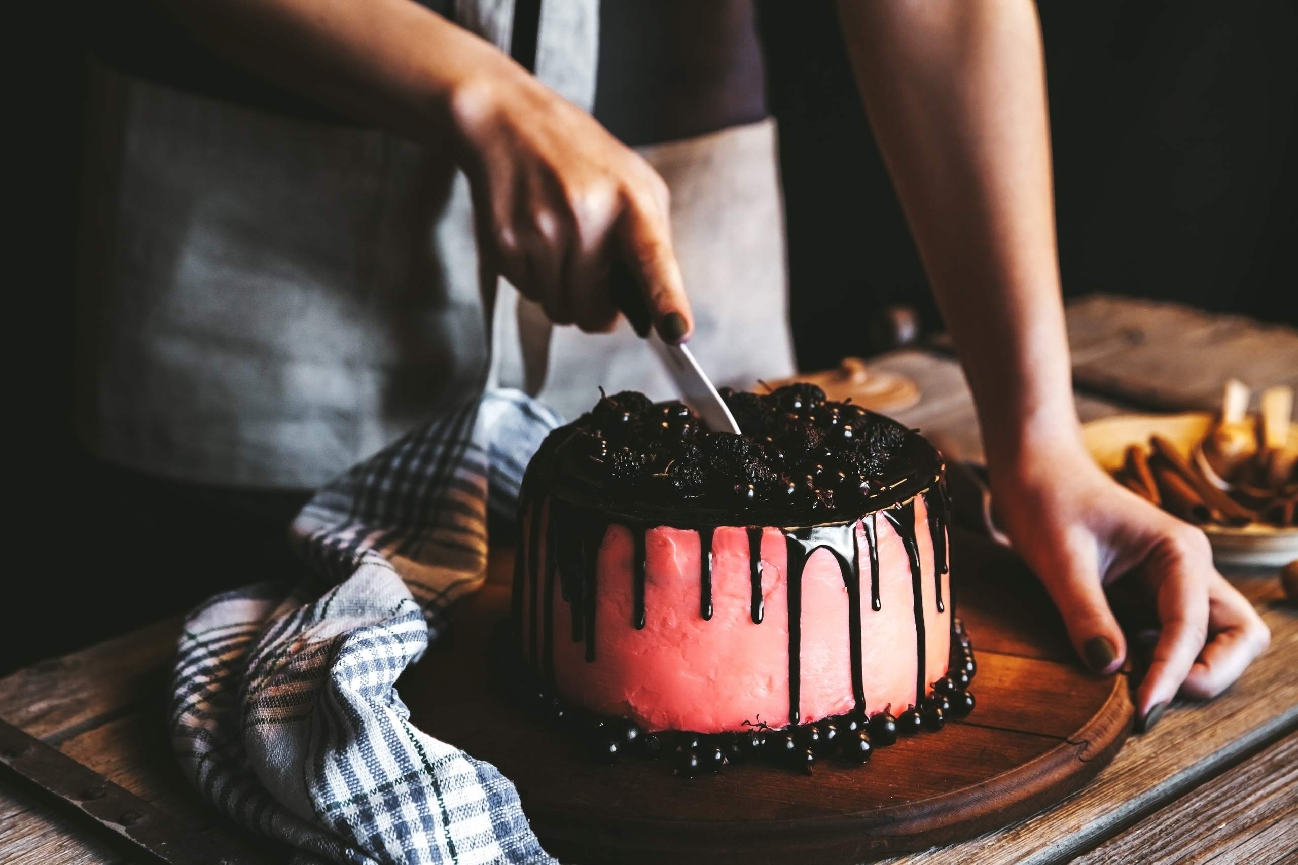
The first thing most people will notice about a decorated cake is its color. When selected properly, a great color combination can make even a simple design appear classy, fun, trendy or striking.
Of course, you don’t need to be a trained artist or designer to achieve a beautiful color combination on your cakes. With just a few simple guidelines, you’ll be able to select colors that give you the result you’re looking for.
Choose a Main Color First
Before you start selecting a range of colors, you should first determine what your main color will be for your cake. This could be based on the event, the customer’s tastes, the party theme or just the general vibe you’re going for. Once you’ve established what your primary color is, picking your other colors will be a lot simpler.
Keep it to a Few Colors
It’s easy to go overboard when it comes to using multiple colors, resulting in your cake appearing busy. In many cases, two or three main colors are sufficient. From here, you can add a few lighter or darker variations to provide extra depth without the cake feeling too cluttered.
Consult the Color Wheel
A simple color wheel can help you better understand what hues pair well together.
Complementary Colors
Complementary colors are situated directly across from one another on the color wheel. Using them together provides high contrast and is great for highlighting certain decorative elements. For example, pairing blue and orange gives your design an assertive and vibrant look.
Analogous Colors
Analogous colors are located next to each other on the color wheel. Usually, they offer a more subtle and harmonious feel. A cake decorated with varying shades of pink, peach and coral won’t need as much contrast to look cohesive.
Factor in the Event
The reason behind the cake can impact the way you select its colors. Your birthday cakes may have bright, cheerful colors while wedding cakes may call for softer, more subdued tones. Seasonal cakes can use color to establish their theme without requiring a complex design.
Follow the Theme
If the cake is based around a particular theme, pick one or two colors associated with that theme and develop your palette from there. This will ensure a more unified look rather than just adding all your favorite colors.
Incorporate Neutrals
White, ivory, tan, grey and similar neutral colors can provide additional space for bolder colors to shine. A cake doesn’t need to be colorful from top to bottom.
Achieve a Balanced Look
If your decorations feature bold colors, keep your base color neutral. Doing so ensures that the flowers, borders, lettering or other elements remain the focal point. Neutral colors can also contribute to a more refined appearance.
Vary the Tones
Don’t feel obligated to apply one specific level of color intensity throughout your entire design. Varying a single color between a pale, medium and deep shade can provide added visual interest. Using a handful of shades of blue can offer a multi-dimensional look without adding another color altogether.
Test Out Your Colors First
The appearance of buttercream will vary depending on the lighting and the surface that’s used. It’s always best to mix up a small amount of frosting and try out the colors beforehand. This is particularly important if you’re trying to match a specific color.
Allow Time for Color to Settle
In some instances, the color will deepen after leaving the frosting to sit for a bit. Wait until the frosting has had a chance to settle before assuming it’s too light and adding a lot more color.
Wrapping Up
Selecting the colors for your cakes is both a science and an art. Select a primary color, establish a limited color palette, take the occasion into account and use contrast along with neutral colors to achieve a balanced composition. Above all else, be open to experimenting. Test out color schemes you wouldn’t normally use and see how it affects the overall aesthetic of your design. Your cakes don’t have to have an intricate design to make an impression. Sometimes, it’s all about a well-considered selection of colors to elevate your basic design.